
02 · Selected Work
Pay Mi
A peer-to-peer payments app built around one sentence: who, how much, what for. From the welcome screen to a receipt — and a failure state that says exactly what did not happen.
Role
Design & build
Year
2026
Type
Mobile payments app
Stack
Expo · React Native · TypeScript
The flow
Press and hold a screen
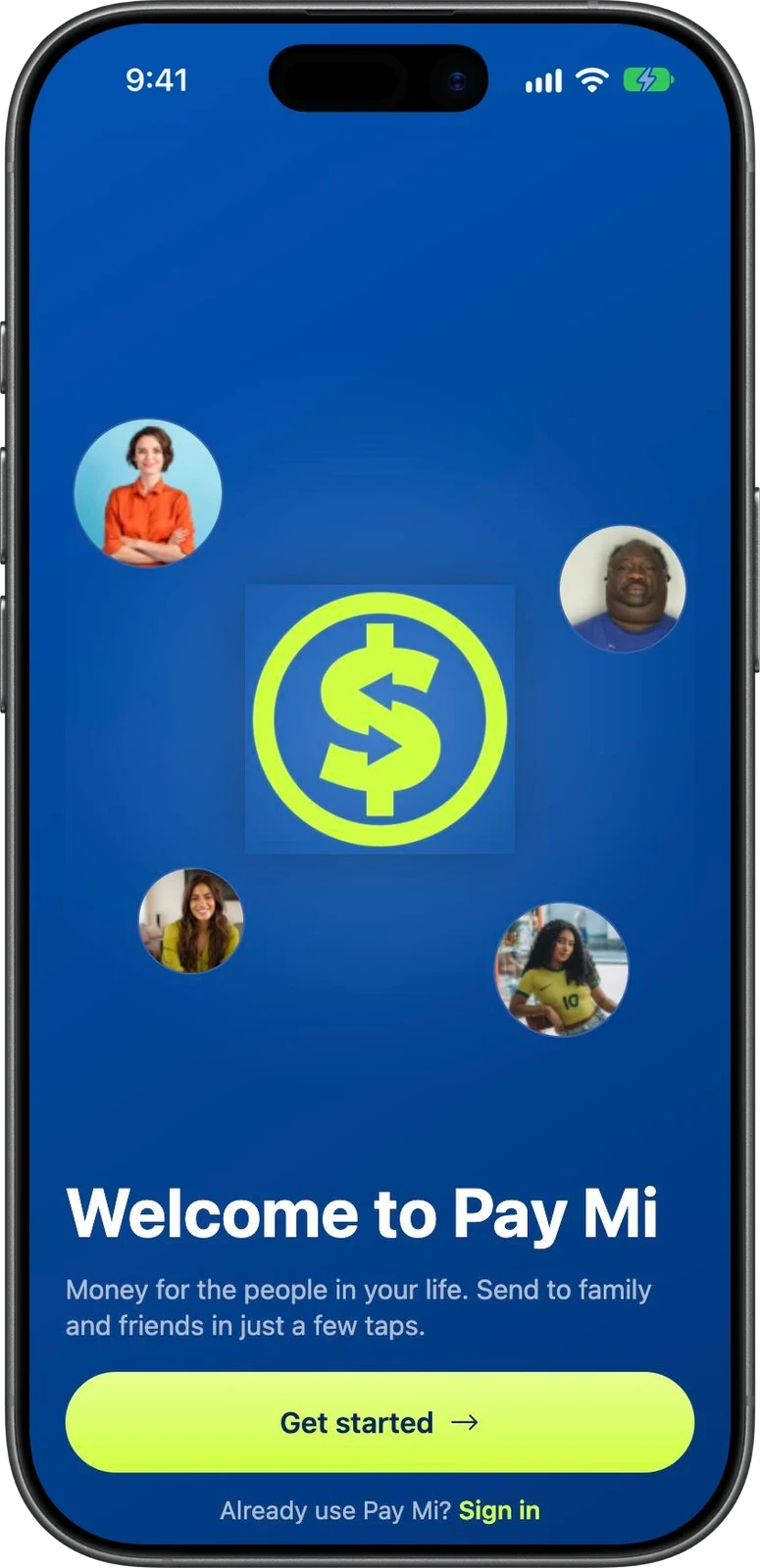
01 · Welcome
Money for the people in your life

02 · Home
Balance, the last 30 days, frequent faces

03 · Amount
The amount comes first

04 · Recipient
Then who it is for
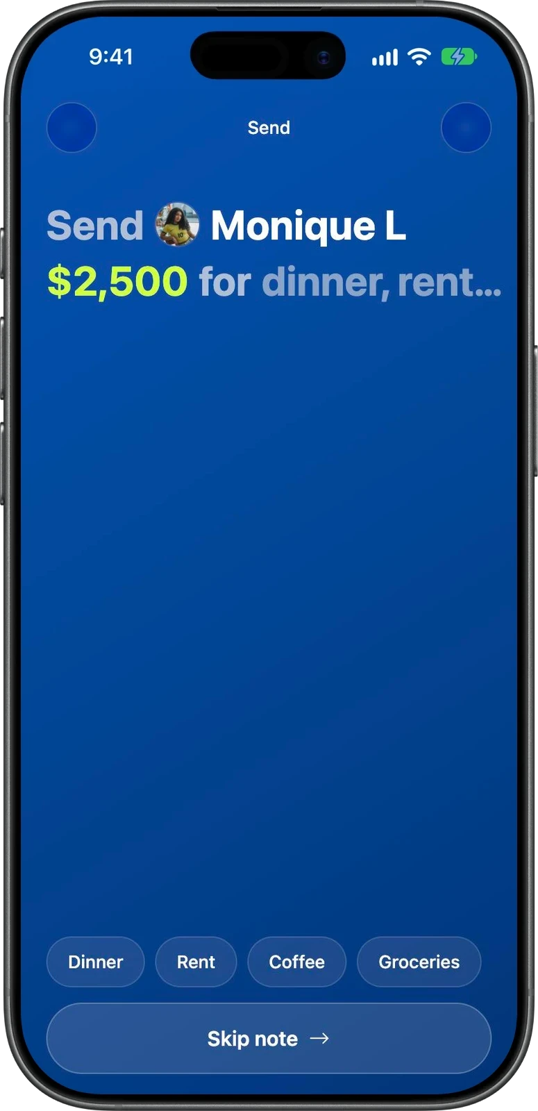
05 · Note
A sentence, not a form

06 · Review
Fee and total before you commit
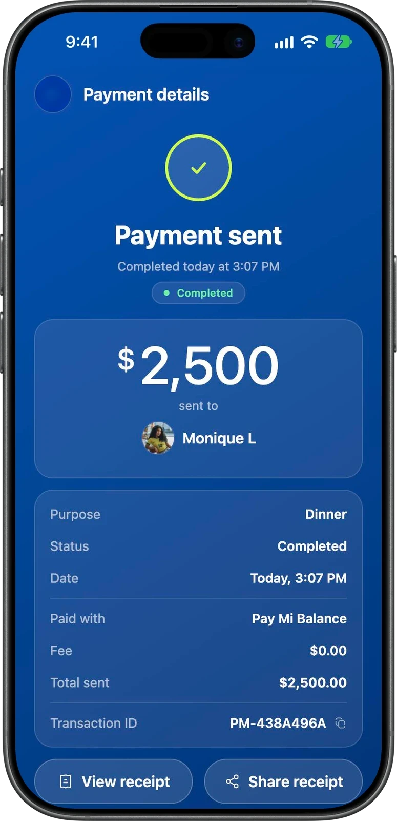
07 · Receipt
A transaction ID you can copy and share

08 · Failed
No money was deducted
Decisions worth noting
The sentence is the form. Once you have an amount and a person, the screen reads “Send Monique L $2,500 for dinner”. The note step is the end of that sentence, with Dinner, Rent, Coffee and Groceries as one-tap endings and a Skip for everyone else. Nothing asks you to fill in a field.
Amount first, then who. The Send tab opens on a keypad, not a contact list. Most people already know the number; the app asks for it before it asks anything else, and the recipient step carries the figure in its heading so you never lose it.
Fee and total are shown even when the fee is zero. The review screen lists the payment method, a $0.00 fee and the total, with a plain line that payment details are encrypted. Showing a zero is still showing it.
A failure says what did not happen. The failed screen leads with “No money was deducted” before the reason — it couldn’t connect securely — and offers Retry payment and Help. The first fear after a failed payment is whether it went through, so that is answered first.
The receipt is a screen, not a toast. Status, purpose, date, payment method, fee, total and a copyable transaction ID, with View and Share receipt. It also says the payment is private, visible only in your own activity.
It says it is a demo. Mock mode is a simulation: no real money, banks or identity checks exist, and sending exactly $13.13 is how you reach the failure state on purpose.
Interested in something similar?